Showing posts with label 2000s. Show all posts

Wednesday, 19 June 2013

Fleet Foxes by Fleet Foxes

With their full-length self-titled debut, Fleet Foxes found themselves at the top of many of 2008's 'album of the year' lists. When you look back, sometimes these lists only serve to highlight albums that fail to stand the test of time. But last year it featured well in Pitchfork's People's Listcoming in 18th place in a reader-compiled poll of the 200 best albums released in the life of the website up to that point (1996-2011).


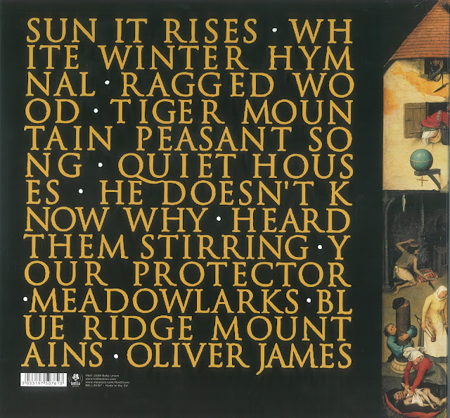
The album's cover, a reproduction of Pieter Bruegel's Netherlandish Proverbs, echoed the music inside; seemingly of another time and out of step with the prevailing trends. The back cover, with its somewhat medieval font, while nothing particularly noteworthy in itself, continues this sense of displacement.

As with other albums featured here, it is likely I first heard about the band through The Guardian's Paul Lester via his excellent New Band of the Day (have another read, its always refreshing to revisit what people thought of a band before they became the critic's darlings). Also from the Guardian, a nice piece here by Jonathan Jones on judging albums by their cover, in which he concludes, "[a]s for Fleet Foxes, the thrill of their cover is that it ignores all convention and fashion - instead of a designer image here is raw art. It is a classic, and so is the recording inside." The album artwork went on to win the Art Vinyl prize for best cover that year.

As lead singer Robin Pecknold told Drowned In Sound: "“When you first see that painting it’s very bucolic, but when you look closer there’s all this really strange stuff going on, like dudes defecating coins into the river and people on fire, people carving a live sheep, this weird dude who looks like a tree root sitting around with a dog. There’s all this really weird stuff going on. I liked that the first impression is that it’s just pretty, but then you realise that the scene is this weird chaos. I like that you can’t really take it for what it is, that you’re first impression of it is wrong.”

Monday, 11 March 2013

De Stijl by The White Stripes


Named after a Dutch art movement, its a stylistic homage carried through into the front and back covers, and indeed their style full stop.

In an interview with Bangsheet Jack White explains. "I'd read a lot about the (De Stijl) movement at one point and it was just my favorite art movement because it was such a simple concept. I thought it was almost the equivalent to what we try to do with our music. The most interesting thing to me though, the reason I thought De Stijl would be a good name for the album, was the idea that when the De Stijl movement had been taken so far it got so simplistic that they decided to abandon the movement in order to build it back up again from nothing. That's kind of how I felt about this album. We had wondered how simple we could get things before we would have to build it back up again. How simple we could get with people still liking what we do. And on this record we added some piano and violin and stuff, so I though it fit kind of perfectly - that structure, that building it up.

In the same way, we always wear red and white (or black) at our shows. It's kind of like our "colors". We always do everything that way to kind of keep order. And that philosophy is reflected in the De Stijl movement."

In a 2003 interview with the Guardian Keith Cameron noted that "they don't so much make a virtue of simplicity as treat it like a religion. In a sleeve note to their second album, De Stijl (named after the post-first world war modernist art movement which included among its followers Piet Mondrian and Gerrit Rietveld), Jack wrote: "When it is hard to break the rules of excess, then new rules need to be established." The De Stijl credo favoured straight lines and primary colours. The White Stripes are never seen dressed in anything other than red or white, with black accessories, and apply a strict minimalist ethos to their art, which in Jack's mind all revolves around the number three."

In the same interview White elaborates. "The first time it hit me, I was working in an upholstery shop. There was a piece of fabric over part of a couch. The guy I was working for put in three staples. You couldn't have one or two, but three was the minimum way to upholster something. And it seemed things kept revolving around that. Like, you only need to have three legs on a table. After two, three meant many, and that was it, you don't have to go any further than that: the three components of songwriting, the three chords of rock'n'roll or the blues - that always seemed to be the number."

In the liner notes the cover concept is credited to The White Stripes, noting "the album contains the designs, sculptures, and sketches of: Paul Overy, Gerrit Rietveld, Theo Van Doesburg, Georges Vantongerloo, Vilmos Huszár".

Wednesday, 17 October 2012

In Rainbows by Radiohead

"Knocking over a table covered in candles [and] NASA’s website" Thom Yorke (on the inspiration for the album's art-work, as told to The Believer magazine )


The story of how Radiohead chose to market and charge for In Rainbows is well known (without a record label, initially only in digital format on their own website, with buyers able to pay as much or as little as they liked), but the artwork was part of the intrigue that surrounded the album's release. Initialy the band decided not to include a cover for the digital release of the album, ditching it last minute and holding it back for the physical release. In the absence of a cover, people even made their own.

The artwork, both back and front, was designed by Stanley Donwood, who has worked with Thom Yorke on all of Radiohead's album covers since The Bends. In The Believer interview Yorke explained the genesis on the In Rainbows cover:

The Believer: It’s funny, because the loss of palpable CD artwork seems like it would effect Radiohead more than other bands, considering that your artwork collaborations with Stanley Donwood have become so linked to your aesthetic. How do you normally work with Donwood on artwork?

Thom Yorke: Has it? Well, the In Rainbows artwork came literally from him knocking a table over. He had some candles on a table and, well, we were gonna do some pornographic etchings, which didn’t work out for a number of really good reasons…. They were pornographic landscape etchings.

The Believer: Pornographic landscape etchings, huh? Is that how I would describe them if I saw them?

Thom Yorke: No, you’d say, “That’s a bunch of fucking scratches on a piece of paper, mate.” [Laughs] But in the process of doing that he knocked all these candles onto his paper and thought, Well, that looks nice, scanned it in, and went from there.

The Believer: And weren’t NASA pictures somehow involved?

Thom Yorke: Me and my son got into watching the shuttle live. And one day I ended up at the gallery to the NASA page, which is fucking amazing. So all my input ended up being, “Here, look at these NASA pictures.”

The Believer: So you’ll continue collaborating with Stanley on artwork? This isn’t the end of Radiohead album art as we know it?

Thom Yorke: No, we’ve actually got a really good plan, but I can’t tell you what it is, because someone will rip it off. But we’ve got this great idea for putting things out.

The NASA images seem to have been the main source of inspiration for the back cover.

In an interview with A.V.Club, Ed O'Brien and Thim Yorke elaborated on Donwood's role:

Ed O'Brien: Stanley is always in the studio with us when we're working.

A.V.Club: Is that by design?

Ed O'Brien: He's either in a little room adjacent or above us in the mezzanine, or in the shed at the bottom of the gully. He's always with us, and we need him in that creative process. Not just for his artwork, but because he'll say, "I know nothing about music, but that was fucking brilliant!" By being there, the music seeps into him. He listens to things the same we do, having it repeated over and over and over again. It gets in him, and the stuff in that—the mood of the songs—is conveyed in the artwork. He's a receptor to that, and that's great.

Thom Yorke: There can be some really difficult times in the studio, but most of the time, we have a laugh in it. A lot of times, when we're doing the artwork and things, there is an element of comedy about it—I've been throwing wax at bits of paper! It's not exactly the punk ethic, but we always end up taking a piss.

For his part, Donwood told Radio 4, "Well it's very colourful – I’ve finally embraced colour! It's a rainbow but it is very toxic, it's more like the sort of one you'd see in a puddle." In an interview with Junkmedia, of his work he said, "My work that I call 'art' is largely concerned with what could be termed 'political' issues. This is the work that I find hard, challenging, difficult, awful, painful, and ultimately, sometimes, rewarding. But I do also feel very drawn to create work that I sincerely hope people will find beautiful. I hope my work for In Rainbows will have some sort of effect in this way."

Monday, 20 August 2012

Kitty, Daisy & Lewis


Bought before I had heard them play a note. Kitty, Daisy & Lewis were enthusiastically recommended to me while at a festival they were playing recently. So I bought this at the on-site record tent in anticipation they might sell out if they were as good as I was expecting. I wasn't disappointed. Their rockabilly-infused blues is perfect festival watching and listening, seamlessly mixing covers with originals. This is a 7" off their first album, a cover of Going Up the Country backed with Say You'll Be Mine.
 
Devotees to all things analogue, they have built a home studio dominated by antique recording equipment. There records are part of the whole package too, with 50s styling and thick, heavy-weight vinyl thrown in. Apparently, the vinyl was also cut by Lewis using his own equipment at The Exchange Mastering Studios.