Thursday, 26 December 2013

Live At The Cellar Door by Neil Young


Live at the Cellar Door is the latest in Neil Young’s Performance Series of archive concert releases. That it is numbered 2.5 in the series, chronologically following volume two (Live at the Fillmore East from March 1970) and preceding the third instalment (Live at Massey Hall 1971), suggests the tapes for this gig have surfaced since the original release schedule was drawn up. Or maybe it’s just Neil being Neil, cantankerous as ever. Indeed, much of the early talk around this release has focused on how chronologically close the performance is to the Massey Hall concert, which was recorded only one month later. There has therefore been some disgruntlement that this has been an opportunity missed to release something from another period, say the late ‘70s, which is as yet uncovered by the Performance Series. This of course will not stop people buying it, not least because those who already own Massey Hall will most likely be Neil devotees and they’ll want this too. And rightly so. This comes from arguably Young’s most fertile period, when he was so prolific he was playing songs live he would not get round to recording released versions of until years later, if at all. But with Massey Hall considered by many to be the last word on early 1970s solo Neil live, does Cellar Door have anything to add?
Cellar Door shares seven of its 13 tracks with Massey Hall. Where Massey Hall points towards HarvestCellar Door focuses on his third solo album, After the Gold Rush (released just three months before this gig), along with songs from his time with Buffalo Springfield. Interestingly, it ignores his first self-titled solo album altogether. This set feels more intimate than Massey Hall but also more tentative, reflecting perhaps the fact that these shows were considered a warm-up for a Carnegie Hall gig a few days later. Given the quality of the songwriting this isn’t really a criticism and the tracks come over as fresh and new born. There is also less of the rambling, albeit charming, between-song banter that peppered Massey Hall. The main exception is the introduction to ‘Flying On The Ground Is Wrong’ when Young gives a suitably stoned-sounding explanation that the song is about dope. If anything, the crowd is even more polite than Massey Hall, which only adds to the intimacy.
As with Massey Hall, Cellar Door mixes acoustic guitar tracks with songs demonstrating Young’s elegant and understated piano playing.  In fact, it’s the piano songs that provide many of the highlights, such as a majestic ‘Expecting To Fly’. Most notable though is the rare, and beautiful, piano version of ‘Cinnamon Girl’, which given it is one of his early signature guitar songs, shouldn’t work but does (“That’s the first time I ever did that one on the piano” he notes at the end). It also features the first performances of ‘Old Man’ (the only track to appear from Harvest, which was still over a year away) and ‘See The Sky About To Rain’, which didn’t surface officially until On The Beach, four years later.
Given the man’s track record, Young fans are used to erratic release schedules and they should soon stop worrying about what could have been released. With Neil you never know what’s around the corner anyway. Whether Cellar Door is better or worse than Massey Hall is somewhat irrelevant – it’s just wonderful to have both. As one contributor to a discussion board on a Neil Young fan site says, “Repetition doesn’t matter, hearing the performances does.” We couldn’t agree more.
This review originally appeared for Muso's Guide in December 2013.
As a postscript, Neil Young News, a news blog from fan site Thrasher's Wheat, returned to the old Cellar Door venue to 'recreate' the gatefold photo used for the album. Read more here.

Sunday, 8 December 2013

Year-end List


I thought I would share the list of albums I submitted to Muso's Guide for their year-end list. Interestingly, I feel as if I have been much more engaged with music this year, although not because I've listened to more. I have actually had less money to spend on it and this has meant buying less and listening more. I think my listening experiences have been better for it. I've also focused my buying on vinyl, so less frivolous 'only ever to be listened to once' downloads. Add to that the fact that I've been casting the net a little closer to shore; I've paid attention to the output fewer labels and blogs, but really engaged with the ones I have followed. Of course this approach means there will have been much great stuff released this year I simply won't have listened to, but a manageable and deep listening experience seems preferable to me.

Paradise of Bachelors releases are most heavily represented here, a consistently brilliant label I've written about before. That's a selection of their back covers to the right, all of which feature in my list. As ever I have also kept a close eye on what Light In The Attic have been up to; more unwieldy but always interesting. This hasn't been to the exclusion of other labels, but these are the two I return to most often to see what they are up to.

The writers who have consistently pointed me in the direction of great music have been John Mulvey (of Uncut Magazine. I strongly recommend you follow his Wild Mercury Sound blog) and the Aquarium Drunkard site generally, but particularly Tyler Wilcox (also check out his Doom & Gloom From The Tomb musings). Where possible I have added links to relevant articles for each album.

Anyhow, here you go (in no particular conscious order):

1. Hiss Golden Messenger - Haw
2. William Tyler - Impossible Truth (reviewed for Muso's Guide here - that's the back cover at the top)
3. Steve Gunn - Time Off
4. Wooden Wand- Blood Oaths of the New Blues
5. Matthew E White - Big Inner
6. Michael Chapman - Wrecked Again (reissue)
7. Kurt Vile - Wakin' on a Pretty Daze
8. White Denim -  Corsicana Lemonade
9. Lal Waterson - Teach Me to Be a Summers Morning (reissue)
10. Chris Forsyth - Solar Motel
11. Bob Dylan - Another Self Portrait (reissue)
12. Golden Gunn - Golden Gunn
13. Promised Land Sound - Promised Land Sound

To this I would definitely add a couple of late entries that I have only just got hold of:

14. Neil Young - Live At Cellar Door (I reviewed this for Muso's Guide here)
15. Daniel Bachman - Jesus I'm A Sinner

Thursday, 10 October 2013

Folk, Blues & Beyond by Davy Graham


This is definitely an example of an album I would not have been aware of were it not for my father. The fact that he had had a radio show on an RAF base that he named after it slipped out in conversation in the way you often hear of your parents past. It comes from a time when the back cover was a story and piece of literature in itself. There is wonderful commentary about each song and the back cover literally speaks for itself.

My interest in Graham was piqued by the fact that he had written Angi, later played by Bert Jansch and Paul Simon. Always in the shadows, including extended periods in retirement, a few years before his death I was surprised to learn that he was playing in a small club down the road from where I lived in Crouch End, London at the time. I duly went along and saw a man who can only have been a shadow of his former self. Almost toothless, which must have affected his singing, but I don't recall this, or indeed whether he sang at all. I think I was just amazed that someone who had been so influential* was yards away from me playing in a tiny venue, well passed his prime, but still doing what he loved.

*he is credited with introducing the DADGAD guitar tuning to the English folk scene, which was subsequently used by John Renbourn, Bert Jansch and Jimmy Page.

Tuesday, 13 August 2013

Wasted by Vernon Wray


I had not even heard of this album nor its creator six months ago and I only had a passing knowledge of Link Wray, Vernon's younger but more famous brother. Link tends to feature in 'best guitarists' lists, principally due to his 1958 instrumental hit 'Rumble' (on which Vernon played alongside their other brother Doug as the Raymen). Link has also featured on two great compilations that I've played a lot over the last couple of years (Country Funk on Light In the Attic and Delta Swamp Rock on Soul Jazz Records). But this is about Vernon.

I first read about Wasted in T. Klepach's appreciation of the album on the excellent Aquarium Drunkard blog (where incidentally I also first heard about Chris Darrow's Artist Proof, another 'lost classic' which will no doubt get a post of its own at some point and I would urge anyone to search it out). I was then reminded of it again when I saw Grayson Currin, who writes for Pitchfork and others (he recently wrote a great piece on Hiss Golden Messenger for Indy Week), rate it in his 'top five'. Seemed worth digging further.

The back cover is an illustration by Rick Cole who also took the front cover photograph. If that weren't enough, he  played on the album too. The illustration depicts the Wray's "family recording studio, which had a number of temporary homes that included the family grocery store before coming to a temporary rest in a ramshackle shed on the family property in Accokeek, Maryland where it was famously dubbed Wray's Shack 3 Tracks." Klepach goes on; "[i]n the spring of ‘72 [Vernon] packed up the back wall of the recording shack and high-tailed it to Tuscon, AZ to “mellow out”. In Tuscon he rebuilt the recording studio renaming it Vernon Wray’s Record Factory after upgrading it to eight tracks from three. It was here that Vernon was able to put to tape his much mellower solo work released in two batches as “Superstar at My House” and “Wasted”. The former being released exclusively on cassette and 8-track tape, and the latter by Vermillion Records on vinyl in a run of about 400 copies sold only at shows in Tuscon. Both albums are extremely rare and prized." With his drawing Cole echoes the laid-back countrified feel of the songs within. Note too the '(+5)' in the credits after Wray's Shack 3 Tracks acknowledging the upgrade to 8-track! 

Having been reissued on vinyl by Sebastian Speaks, William Tyler's Nashville-based label, I was surprised, but grateful, to find it in Drift Records in Totnes. Wasted is a record full of soul that has a wonderful feel. Ghostcapital gets it right: it "[b]rings to mind a Waylon-type Highwayman cutting a handful of lonesome, stoned-out 70s demos with ocassional help from the likes of, say, Lee Hazlewood." For more on Vernon, see here.


Wednesday, 19 June 2013

Fleet Foxes by Fleet Foxes

With their full-length self-titled debut, Fleet Foxes found themselves at the top of many of 2008's 'album of the year' lists. When you look back, sometimes these lists only serve to highlight albums that fail to stand the test of time. But last year it featured well in Pitchfork's People's Listcoming in 18th place in a reader-compiled poll of the 200 best albums released in the life of the website up to that point (1996-2011).


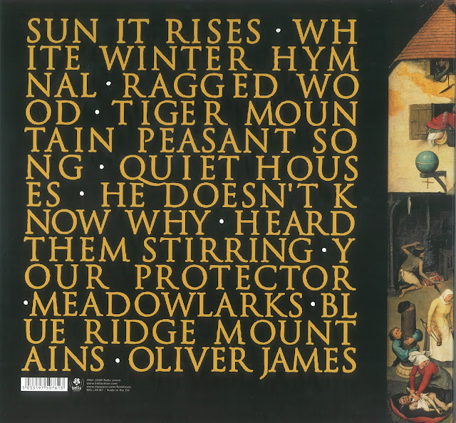
The album's cover, a reproduction of Pieter Bruegel's Netherlandish Proverbs, echoed the music inside; seemingly of another time and out of step with the prevailing trends. The back cover, with its somewhat medieval font, while nothing particularly noteworthy in itself, continues this sense of displacement.

As with other albums featured here, it is likely I first heard about the band through The Guardian's Paul Lester via his excellent New Band of the Day (have another read, its always refreshing to revisit what people thought of a band before they became the critic's darlings). Also from the Guardian, a nice piece here by Jonathan Jones on judging albums by their cover, in which he concludes, "[a]s for Fleet Foxes, the thrill of their cover is that it ignores all convention and fashion - instead of a designer image here is raw art. It is a classic, and so is the recording inside." The album artwork went on to win the Art Vinyl prize for best cover that year.

As lead singer Robin Pecknold told Drowned In Sound: "“When you first see that painting it’s very bucolic, but when you look closer there’s all this really strange stuff going on, like dudes defecating coins into the river and people on fire, people carving a live sheep, this weird dude who looks like a tree root sitting around with a dog. There’s all this really weird stuff going on. I liked that the first impression is that it’s just pretty, but then you realise that the scene is this weird chaos. I like that you can’t really take it for what it is, that you’re first impression of it is wrong.”

Sunday, 16 June 2013

Postscript: A Different Way To Be

I thought it was worth posting a follow-up to the 'in praise of a grassroots approach to releasing records' post because, tellingly, those mentioned (Michael Taylor of Hiss Golden Messenger, James Jackson Toth of Wooden Wand and Brendan Greaves of the Paradise of Bachelors label) all took the time to reply back. This speaks volumes and just goes to reinforce the whole thrust of the post. It was James who got in there first and posted a lengthy response, adding some great insights into why he continues to embrace a grassroots approach. It is well worth sharing some of his reply:

...Don't wanna speak for [Michael Taylor] or [Paradise of Bachelors], but I think the sort of ethos you describe can be attributed to our shared background in punk. When I was a kid, whenever I would order a single from a band or label I liked, they would invariably send stickers, patches, letters (see my interview with HGM!), sometimes even additional records! I like the idea of continuing that tradition, especially these days, when the lure of free music is so strong. I always felt like Dischord actually appreciated the fact that I ordered records from them, and I'd like [Wooden Wand] fans to get the same feeling when they buy something directly from me. I never got a handwritten postcard from Dave Mustaine and I never get free buttons (you guys call them 'badges') when I order something from Amazon. Of course, for this to work, we need people like you, and I don't mean that in the patronizing 'we love you, Cleveland' kinda way. I'd agree that you are the definition of a 'fan' in 2013, the only kind that really matters, and if you keep checking in on us and forgive us our occasional trespasses (we all have a Landing On Water in us, you know), we'll keep showing our appreciation...


Secondly, as a result of the post I got a pretty special delivery of records from my father's record collection (see photos). These included Davy Graham's Folk, Blues & Beyond, John Fahey's Blind Joe Death, VU's White Light/White Heat, a couple of Creedence and Zeppelin and a Mississippi John Hurt. If you owned only these records it would still amount to a pretty amazing collection!


Monday, 11 March 2013

De Stijl by The White Stripes


Named after a Dutch art movement, its a stylistic homage carried through into the front and back covers, and indeed their style full stop.

In an interview with Bangsheet Jack White explains. "I'd read a lot about the (De Stijl) movement at one point and it was just my favorite art movement because it was such a simple concept. I thought it was almost the equivalent to what we try to do with our music. The most interesting thing to me though, the reason I thought De Stijl would be a good name for the album, was the idea that when the De Stijl movement had been taken so far it got so simplistic that they decided to abandon the movement in order to build it back up again from nothing. That's kind of how I felt about this album. We had wondered how simple we could get things before we would have to build it back up again. How simple we could get with people still liking what we do. And on this record we added some piano and violin and stuff, so I though it fit kind of perfectly - that structure, that building it up.

In the same way, we always wear red and white (or black) at our shows. It's kind of like our "colors". We always do everything that way to kind of keep order. And that philosophy is reflected in the De Stijl movement."

In a 2003 interview with the Guardian Keith Cameron noted that "they don't so much make a virtue of simplicity as treat it like a religion. In a sleeve note to their second album, De Stijl (named after the post-first world war modernist art movement which included among its followers Piet Mondrian and Gerrit Rietveld), Jack wrote: "When it is hard to break the rules of excess, then new rules need to be established." The De Stijl credo favoured straight lines and primary colours. The White Stripes are never seen dressed in anything other than red or white, with black accessories, and apply a strict minimalist ethos to their art, which in Jack's mind all revolves around the number three."

In the same interview White elaborates. "The first time it hit me, I was working in an upholstery shop. There was a piece of fabric over part of a couch. The guy I was working for put in three staples. You couldn't have one or two, but three was the minimum way to upholster something. And it seemed things kept revolving around that. Like, you only need to have three legs on a table. After two, three meant many, and that was it, you don't have to go any further than that: the three components of songwriting, the three chords of rock'n'roll or the blues - that always seemed to be the number."

In the liner notes the cover concept is credited to The White Stripes, noting "the album contains the designs, sculptures, and sketches of: Paul Overy, Gerrit Rietveld, Theo Van Doesburg, Georges Vantongerloo, Vilmos Huszár".

Thursday, 21 February 2013

Songs for Beginners by Graham Nash


When I saw this is a secondhand record shop I was more taken by the colours and blurred image than by knowing much about the album. Turns out that Graham Nash, a well-respected photographer in his own right, took both the front and back cover photographs.

In fact, this wasn't an album I was familiar with until I read a review of a tribute album that covered of all its songs and included versions by the likes of Robin Pecknold and Bonnie "Prince" Billy. I had also picked up on the love for this album from Woods' cover of "Military Madness".

I always feel lazy relying on Wikipedia, but the entry for for "Album Cover" does contain an eclectic mix of examples when it comes to musicians creating their own artwork: "As one would expect, a number of artists and bands feature members who are, in their own right, accomplished illustrators, designers and photographers and whose talents are exhibited in the artwork they produced for their own recordings. Examples include Jimmy Page (Led Zeppelin IV), Chris Mars (Replacements’ Pleased to Meet Me and others), Marilyn Manson (Lest We Forget…), Michael Stipe (REM's Accelerator), Thom Yorke (credited as "Tchocky" on misc. Radiohead records), Michael Brecker (Ringorama), Freddie Mercury (Queen I), John Entwistle (Who By Numbers), Graham Coxon (13 and most solo albums), Mike Shinoda (various Linkin Park albums), Joni Mitchell (Miles of Aisles) as well for Crosby, Stills, Nash & Young (So Far), and M.I.A. (credited variously on Elastica's The Menace, her records)."

For more examples of Graham Nash's photography visit here or his website.

Thursday, 24 January 2013

Marquee Moon by Television

The iconic front cover photo was taken by the legendary and occasionally controversial Robert Mapplethorpe (who also took the photograph that appears on the cover of Patti Smith's first album, Horses), but very little information seems to exist for the back of Marquee Moon. The spiral design is credited to Billy Lobo, but I can find no more out about him beyond that. It looks almost James Bond-esque, but does perhaps echo what Pitchfork called a "shockingly economical" album with a "tightly wound web of simple guitar parts".

What the back does contain though is an example of the sort of detail music lovers delight in. It lists which of the two guitarists played each solo. 


Nick Kent wrote an infamous review for NME on its release, which is worth quoting: "Marquee Moon is an album for everyone whatever their musical creeds and/or quirks. Don’t let any other critic put you off with jive turkey terms like ‘avant-garde’ or ‘New York psycho-rock’. This music is passionate, full-blooded, dazzlingly well crafted, brilliantly conceived and totally accessible to anyone who (like myself) has been yearning for a band with the vision to break on through into new dimensions of sonic overdrive and the sheer ability to back it up. Listening to this album reminds me of the ecstatic passion I received when I first heard ‘Eight Miles High’ and ‘Happenings Ten Years Ago’ – before terms like progressive/art rock became synonymous with baulking pretensions and clumsy, crude syntheses of opposite forms."

More recently, Chris Dahlen writing for Pitchfork mirrored these sentiments: "the things that make the record so classic, that pump your blood like a breath of clean air, are the guitars. This whole record's a mash note to them. The contrast between these two essential leads is stunning: Richard Lloyd chisels notes out hard while Verlaine works with a subtle twang and a trace of space-gazing delirium. They play lines that are stately and chiming, rutting and torrential, the riff, the solo, the rare power chord, and most of all, the power note: the second pang on the riff to "Venus de Milo" lands like a barbell; the opening bars of "See No Evil" show one axe rutting the firmament while the other spirals razorwire around it.

What Matt LeMay had to say for the album's entry into Pitchfork's Top 100 Albums of the 1970s was an alternative take on the guitar parts, but was no less in awe of the end result: "Its lengthy and numerous guitar solos are individually credited in its liner notes. But at its core, Television's Marquee Moon is shockingly economical-- a tightly wound web of simple guitar parts wrapped around Tom Verlaine's straightforward and impressionistic songwriting. Taken out of context, the guitar solos on Marquee Moon aren't just unimpressive; they're downright illogical. Everyone who plays guitar will, at some point, learn the solo from "Stairway to Heaven", but it's practically impossible to sit down and actually play anything from Marquee Moon. Like The Velvet Underground before them, Television's songs focus on interplay and exploration, rather than individual melodies and chord progressions.

This, of course, is just icing on what is unquestionably the finest release from one of the most talented bands to be nurtured by the scum-soaked floors and paint-chipped walls of 1970s CBGB's. The subtle buildup of "Marquee Moon", the nervous energy of "See No Evil", and the melodic tension of "Guiding Light" are all songwriting masterstrokes, articulated perfectly by able and adventurous players. The punk scene from which Television emerged is often cited as discarding the concept of musicianship entirely. And in a sense, this is exactly what Television did with Marquee Moon, recasting virtuosity as a function of the brain, not the fingers."

It is clearly an album that moves people, which is all you can really ask.

Monday, 21 January 2013

Yazoo Records


Another blues record where the back cover is more academic, almost archaeological, and attracts attention because of the information it contains. It comes from my father's fantastic collection of blues records assembled during the blues revival of the 60s and 70s.

"It is a compilation of tracks recorded by blues artistes Leroy Carr (piano) and Scrapper Blackwell (guitar) entitled "Leroy Carr & Scrapper Blackwell - Naptown Blues 1929-1934". During the blues revival in the '60s and '70s a number of labels emerged which compiled old, mainly pre-war, 78 rpm recordings borrowed from collectors' libraries of rare originals. One of these labels, Yazoo, was founded in New York by Nick Perls in 1967, adopting an art deco peacock as its logo taken from the 1927 Black Patti label (see below). As can be seen from the back of the album, released as Yazoo L1036 in 1973, there is little to attract the artistically minded but much to anyone interested in details of the content and the performers, even, in this case, to the extent of seeing the death certificate for Leroy Carr who died in 1935. The cover art is attributed to Bob Aulicino who also produced artwork for Nick Perls on the Blues Goose label which he started in 1970 and which focused on live recordings of some re-discovered blues performers as well as some of the up-and-coming artists."

Tuesday, 8 January 2013

No Other by Gene Clark


I first became aware of Gene Clark's No Other from the same 2006 '100 Coolest Albums' list that brought Frank Sinatra's collaboration with Antonio Carlos Jobim to my attention. At the time I had no idea he was a ex-Byrd. Following its release in 1974 it became something of a lost classic after Asylum records, dismayed by the excessive cost of its production and lack of immediate hits, failed to promote it properly. As the Wikipedia entry notes, "[f]urther confounding matters was the album's artwork: the front cover was a collage inspired by 1920s Hollywood glamour, while the back featured a photo of the singer with permed hair and clad in full drag, frolicking at the former estate of [actor] John Barrymore." Modest sales saw it deleted in 1976 and it remained largely unavailable until three tracks appeared on a retrospective of Clark's career, Flying High, released in 1998, with No Other finally seeing re-release in the early 2000s.

In terms of how good the record actually is, Allmusic put it well: "The appearance of No Other on CD in America some 26 years after its release offers the opportunity to hear this record for what it was: a solidly visionary recording that decided to use every available means to illustrate Gene Clark's razor-sharp songwriting that lent itself to open-ended performance and production -- often in the same song (one listen to the title track bears this out in spades)."

As recently as last November, Allan Jones wrote in Uncut about its original release. "When it comes out in the autumn of 1974, Gene Clark's No Other seems to me like an album everybody should hear, nothing short of a masterpiece. I beg for enough space to review it at appropriate length in what used to be Melody Maker, to a wholly unsympathetic response, people regarding me as someone who's taken leave of their senses who should be approached with caution and a very big stick. I'm told to stop my infernal whining and write 100 words on the album, which I do, sulkily, most of them superlatives. The extravagant claims I make on its behalf, however, bestirs few people enough to actually go out and buy the thing. Many more simply ignore the album altogether and it quickly sinks without trace, barely a copy sold...No Other was meant to be the album that returned him to former glories and was lavishly financed by David Geffen's Asylum Records; to the tune, some said, of $100,000. This is a lot of money for only eight completed tracks and an album that could only have sold more poorly if it had remained unreleased. When Clark announces to an appalled Geffen that for a follow-up he intends to record an album of "cosmic Motown", he's introduced to the wooden thing in the wall otherwise known as the door."